
Not all businesses know it, but content marketing and social media go hand in hand, and they’re mighty important to successful marketing. Every great branding campaign needs quality content backed by kickass social media pages to boost traction. A creative, informative and well-crafted blog is time wasted if your audience never has the opportunity to read it.
Unfortunately, when it comes to social media, users are not looking to buy products. In fact, they’re often not even looking for an informative read. Instead, they’re looking for entertainment. So how do businesses use these platforms to shift people’s attention to their own websites? It’s simple – you need to use exciting visuals!
We’ve picked out some of the best brands getting their social media visuals and content marketing right.
Facebook Campaigns
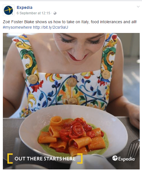
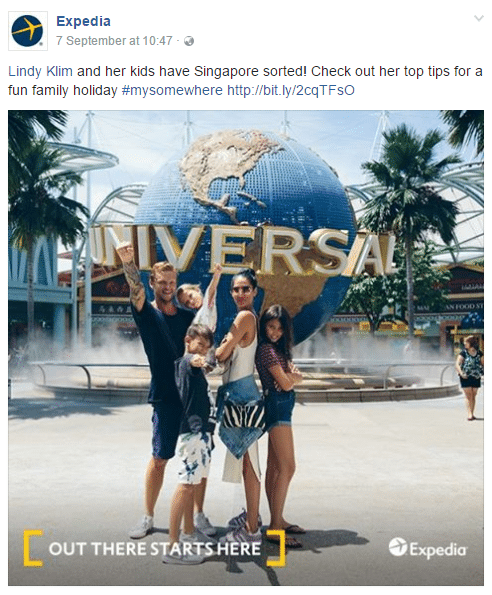
#1 Expedia – It’s all in the slogan.
Expedia primarily sells flights, accommodation and holidays. But it’s a competitive market out there so they need to come up with ways to keep their audience excited about the product. Luckily, they have mastered content marketing with their blog Out There Starts Here. The blog is particularly effective at offering its audience tips, guides and inspiration for their next big trip (which of course they’ll be booking on Expedia).
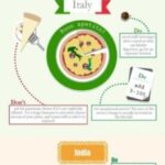
The social campaign accompanies this content perfectly and begs the viewer to click through to read more. Interested in what Zoe Foster-Blake is eating in Italy? Then head to the blog to find out! Maybe book a flight to Italy while you’re at it. Expedia’s Facebook page is such a good example of effective imagery without the fancy graphic designers. Find a relevant and captivating photograph and simply brand it with the slogan of the campaign. Simplicity is key. Just make sure you’re directing your audience back to your website and offering them something attractive. They might not be ready to spend their money just yet so convince them that you’re the leading brand.

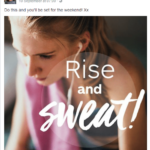
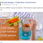
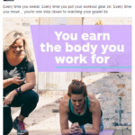
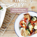
#2 Michelle Bridges’ 12 Week Body Transformation – Keep them motivated.
Michelle Bridges is best known for her appearance as a trainer on the reality TV show Australia’s Biggest Loser. She went on to create her 12 Week Body Transformation – a fitness program aimed at helping people lose weight and keep fit. But a well-known name doesn’t always guarantee the success of a brand. So what has the team behind the program done to launch the business into success? They offer a taste of recipes, workouts and inspiration for the right mindset. People aren’t going to pay for a product or service if they don’t know what it is. Offering free content that’s relevant and promotes your image is a great way to get people hooked and establish yourself as an expert in the field.
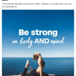
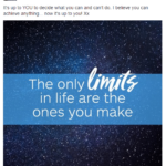
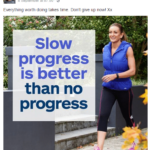
The social media pages aid the success of this method by hooking audiences in and supporting the content that already exists. Motivational quotes are paired with motivational images. “Be strong in body in mind” as a stand alone phrase is not all that exciting but pair it with a woman doing yoga against a mesmerizing backdrop and you’ve got yourself a winner. The images on Michelle Bridges’ Facebook are exciting to look at because they’re colorful. Through the use of different fonts and sizes, the quotes and messages make for a visually exciting experience helping to emphasize certain words like ‘sweat,’ ‘strong’ and ‘limits.’ While motivational quotes seem to have been done to death online, but this is a great way to reinvent the words and reinforce the overall image of the brand.
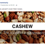
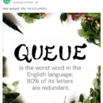
#3 Grammarly – Grammar doesn’t have to be boring.
Grammarly is a writing app that finds and corrects grammatical errors in written text. It’s a service that appeals to a wide range of people but they all have one thing in common – professional editing is not their forte. So how do you make this topic interesting for an audience that do not know they’re there’s from their? Make it fun! Blog posts feature thought-provoking and downright funny content that isn’t limited to the knowledge of a professional editor. Examples of their posts include How Do You Spell Donut – donut or doughnut? There’s even a post on How to Talk like a Pirate. Yes, it’s actually a post dedicated to the origins of how pirates used to speak.
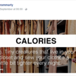
This humor translates so well into social media with simple words accompanied by funny definitions. A great example is the definition Grammarly offers of the word ‘calories’ – “tiny creatures that live in your closet and sew your clothes a little bit tighter every night.” It makes the audience laugh without having to think too much. This content could stand alone as a textual post on Facebook but what’s exciting about that? Accompany every post with an image otherwise your post will be lost in the newsfeeds. Grammarly perfectly demonstrates that you do not need impressive photography – take a stock photo as the background and place your written content on top. It’s so easy and it can be very effective in catching your audience’s attention.
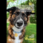
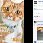
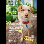
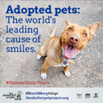
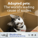
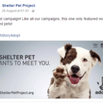
#4 The Shelter Pet Project – Cute faces and kind words.
The Shelter Pet Project offers a search engine for rescue cats and dogs up for adoption. Their aim – to get as many pets into homes as possible. And how do they achieve this? With content marketing and social media of course. As well as offering a list of pets, there’s a section called Adoption Stories. These stories offer success stories on previous adoptions in a quirky and interesting way. It’s great content for those considering adoption and interested in other people’s experiences.
They’ve vamped up these content marketing efforts with the help of social media. Their Facebook page utilizes the adorable pets on offer from various shelters. After all, who could resist those furry little faces? The photographs feature quotes from the pets, which is both creative and adorable. This is another great example of incorporating text into images. The cute pets catch the attention of the viewer just enough for them to read the quote and have a laugh. All the while they have the brand in mind because of the logo placed inconspicuously in the corner of the image. It’s certainly making us want to know more about these furry friends, and maybe even take one home.
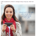
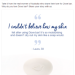
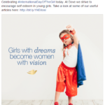
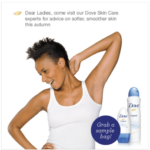
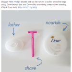
#5 Dove – Natural beauty deserves naturally beautiful design.
Dove are a skincare brand with a strong focus on natural beauty. This is reflected in the content they offer on their blog – Real Read. There are a variety of articles on offer organised in the following categories: For Parents, Lifestyle, Health and Wellbeing, Beauty and Confident Women. Serious issues around body positivity are addressed while lighter content is also on offer, such as teaching your daughter to find her own style and shaving secrets. The focus throughout the blog is on real women that reflect a happy and natural beauty.
This idea is further promoted on Facebook through the simple imagery. The white backdrops and fresh faced female models offer this natural element. It just goes to show that you don’t need to use many colors to create a seamless visual campaign. There’s also variety in the images – some offer the products while others display the women using these products. Accompanied by text, this is a simple visual campaign that has positioned Dove as a brand representing the consumer, not selling to her, all in a minimalist format.
#6 Frank Body – The battle of the scrubs.
Frank Body offers a range of coffee-based skincare products. This business launched only a few years ago but has managed to catapult into a multi-million dollar venture and it’s all thanks to a multi-faceted content campaign. The beautifully designed website features a blog known as The Daily Grind. It’s here that the brand offers a little more than just a scrub – there are interviews with inspirational women, tips on keeping your skin in shape and the most recent development is a battle of the scrubs. Yes, it sounds bizarre but with the range of coffee scrubs growing, the team at Frank Body have kept their fans interested by creating somewhat of a social media attention war.
The teams are divided by four just like the range of scrubs- #teamcacao, #teamcoconut, #teampeppermint and #teamoriginal. It’s genius because it’s the customers who produce a lot of the content and create hype around the product. Throw in a year’s worth supply of the product and you’ve got customers all over the world competing in this viral campaign. So why has this been so effective and why do we love it? Because it looks good! Yes, they’ve managed to make rubbing dirt-like substances all over your body look good. Plus the consistency of the pastel color scheme and design makes the brand one that is easy to recognize and remember. You don’t need a fancy team of graphic designers, just consistency and an incentive for customers to get involved.

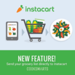
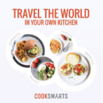
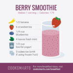
#7 Cooksmarts – picture-perfect cooking.
Cooksmarts is a meal plan service that aims to take the hassle out of cooking. This idea is supported through their online blogging efforts where there’s a whole section of resources with Guides, Lessons, Articles, Videos and Infographics. That’s a whole lot of content for their audience but there’s still the challenge of sharing this content and grabbing readers’ attention.
That’s where Instagram has become so important for their success. Through the use of beautiful, yet simple graphic designs, they’ve translated their recipes and guides into easily digestible imagery. Recipes needn’t even be written out when you can show your audience through design. Another personal touch are the consumer reviews and quotes. While many brands list these reviews and case studies on their site, never to be seen, Cooksmarts has used this valuable content as Instagram posts. Of course, Instagram is a very image-heavy medium so it can’t just be a bunch of words. The quotes are accompanied by the real people behind the reviews. Pair this with a simple color scheme and it is sure to grab the attention of Instagram users.
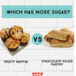
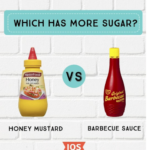
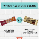
#8 I Quit Sugar – Sugar is bad, creative imagery is good.
I Quit Sugar is another meal plan program with multiple cookbooks also available. The program and cookbooks were created by Sarah Wilson, who also shares her I Quit Sugar blog. The blog offers tips and guides on living a lifestyle free of sugar. This means recipes, guides on ingredients to steer clear of and tips on how to combat cravings.
A huge aspect of the social campaign is to reinforce the ideas on the blog – sugar is bad, no sugar is good. The result is a combination of images. Firstly, there are some amazing images of food (sugar-free of course) to prove to the customer that food without sugar can be delicious, or at least look it. Another aspect of the imagery is the shock factor. Playing foods off each other and asking the Instagram user to interact. Which food do they think has more sugar? The images are simple and yet stand out on the page with their vibrant packaging against the white background. The element that stands out the most here is actually the question at the top, ‘Which has more sugar?’ Play around with the positioning and sizing of text. You might find that this greatly affects the emphasis of your image – so make sure you’re emphasizing the right point.
#9 Frooti – Colour, colour and fun video games.
Frooti is a mango juice popular in India. It’s a single and uncomplicated product so how do you create content and a social media campaign around a fruity drink? The team at Frooti seem to have it figured out with a range of recipes, games and even downloadable ringtones for their audience. They’ve certainly thought outside of the box with what started as a very simple product but the effect is a brand that is recognizable and fun. Delicious cocktail recipes make the audience want to purchase the product because who doesn’t love cocktails? The fun side of the brand comes out in the games as you catch mini diving men in a bottle of Frooti drink – it’s wacky but at least it’s entertaining.
This idea of fun translates perfectly into their Instagram account with the vibrant colours and cute designs. It’s creative, it’s wild and above all it makes you question what the hell it’s all about. Simple square images that offer nothing but except the words “show me the mango #frooti” beckon any stranger who comes across the page to further investigate what exactly Frooti is. But it has to look good. Once you’ve hooked people in, you need to find a way to keep them interested. A button that says “buy me” probably won’t make them take that next step to purchase. Try something more like, Hey, here’s a cool recipe you might like. You should buy me and test it out.

#10 Coschedule – Marketing inspiration on social media.
Coschedule offers a platform to plan and schedule marketing content. But what good is scheduling your blog posts if you’ve got nothing to write about? The team at Coschedule have recognized this and offer a variety of guides on effectively crafting your content marketing as well as social media pages on their blog. Examples include How to Do Facebook Video Marketing the Right Way and How to Write a Pitch Email that Will Get Your Guest Post Accepted. While these topics provide a lot of value for readers, the content can be a little dry if not correctly executed. How do they get around this?
Well they’ve taken their own advice with this one and gotten creative. It’s all about the images, particularly on Facebook! So while they don’t offer a very image-heavy product, they’ve done a great job and finding creative ways to present their content. Stock images fade into the background of a colorful filter. Straight away the viewer is attracted to the bright colours and cannot help but read what’s on offer. In this case, it might be a tip for producing a headline or a relevant quote. The photographs and images don’t always have to be the main focus of the post, in this case it’s the text. But they do need to be there or else your content looks boring (even if it’s really interesting).

#11 Headspace – A serious topic with a not-so-serious design.
Headspace is a not-for-profit organisation that aims to raise awareness around mental health and offers support services. Their website offers a News section on the events and goals within the organisation as well as an abundance of resources categorized by topics such as friends and family, digital work and study and school support. The service revolves around a serious issue but this simply means there’s an even greater urgency to grabbing the attention of the audience. So how do they do it?
The answer is color, accompanied by some great imagery and text. Snippets of content from the website resources offer support to those at a glance but they need to stop and read it to begin with. Bold, bright colors is one of the most effective ways to do this. Then if the viewer likes what they’ve read, Headspace have offered an avenue to find more of the same content on their website. Sometimes you don’t even need text to grab people’s attention. Simple, colorful graphics make people stop and then they can explore further through your post and website. Keep people interested by not giving away too much.

#12 Homeaway – Forget long essays, summarize it in an infographic.
Homeaway allows people to list their holiday house for potential renters or for travelers looking to hire out cheap accommodation. Homeaway are a brand built on those who are looking for luxury at a cheaper price. They’ve also recognized that while most of us would like to holiday more we actually spend more time planning our holidays then we do going on them. For this reason they’ve broken down their blog into three categories – trending in travel, dream destinations and vacation inspiration. There’s travel tips, guides and everything that you need to know about your dream holiday destination. This info and facts can often be tedious and boring to navigate through so how does Homeaway overcome this challenge for their readers?
Through imagery of course! Infographics are a great way to keep an audience interested in what you have to say. Your audience want to learn, but they don’t want to have to work hard to get there. Whilst long and informative articles can be effective in a blog format, when it comes to social we need to keep it short, interesting and of course aesthetically please. Homeaway have perfected this art with their Pinterest account. The pin board offers all sorts of interesting info including eating etiquette and tips on stretching your travel budget. How very useful for travelers, which just happen to be the target market for this business.
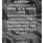
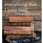
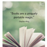
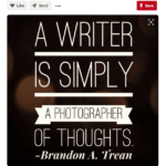
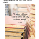
#13 Penguin Random House – Pure inspiration.
Penguin Random House are an international bookseller that produce thousands of titles every year. And while there’s plenty of marketing going into each title they publish, they also need to ensure they have their audiences’ attention in the publishing house itself. So how do you appeal to an avid book reader? You tell them what they have to read, of course. The book publisher has compiled lists of their books for seemingly every type of reader and situation. These lists include 30 Books You Should Read Outside, The 11 Worst Fathers in Fiction and 15 Short Books for Busy People just to name a few. They also feature a blog that offers interviews with some of their authors and writing tips, because often the readers are also budding writers.
So it makes sense to offer inspirational quotes from writers to readers and this is exactly what Penguin Random House have done. It needs to be presented in an exciting way. What do readers love looking at? Books! Lots and lots of books. Hard-cover, yellow paged novels are the best and they look great in photographs so this has worked well in their favor. It’s the same simple idea of pairing quotes with images but there is always room to experiment with fonts and sizes to make the Pinterest boards looking beautiful.
#14 Wholefoods – Food for thought.
Wholefoods is a supermarket chain in the US. They’re killing the content marketing game with a website bubbling with content for the everyday consumer. Content ranges from wholesome recipes to money-saving shopping guides to a list of their favorite wines from Chile. It’s a go to hub for the grocery shopper (so just about everyone) but delivered in a way that’s convenient.
They’ve also relied on Pinterest to direct their audience to the blog. Their Pinterest boards feature colourful photography and images showcasing their produce and meals. The design is simple – a captivating and colourful image paired with bold text highlighting what the blog post offers. It’s so simple and yet so effective for driving traffic to your website.

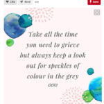
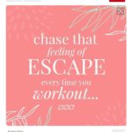
#15 Lorna Jane – Words can be pretty and motivational.
Lorna Jane offers premium fitness apparel for women. In order to sell their brand, they have to sell a lifestyle – a healthy and active one. To pull this off they offer an Active Living section on their website which provides a series of resources to achieve this Lorna Jane lifestyle. Resources include articles on workouts, meal plans, recipes and everyday inspiration.
This content is so well translated on their Pinterest boards which offer a taste of the Active Living resources in a pretty pink format. The inspirational quotes need to reflect the type of mentality and lifestyle they’re encouraging. This Pinterest proves just how important color choices are. This activewear is forwomen so they need to be attracted to it. The colours need to be light and vibrant – just light the women they’re aimed towards, fit and full of energy. It doesn’t have to be complicated, it just needs to look good and reflect the style of the brand. Lorna Jane also uses their Pinterest Boards as a way of promoting blog posts. An image paired with the title of the post is a great way to get people intrigued and curious enough to click through to the website.
These examples prove that you don’t need to allocate a fortune to graphic design for the promotion of your content. An effective social media campaign can be as simple as you like, as long as it reflects the image of your brand. Don’t be afraid to combine your text with imagery, play around with it and above all have some fun with the designs. If you love it, chances are your audience will love it too and that’s a good step towards a successful brand.